Portfolio 2026 · UX/UI Designer
Roland Majnik
I design clear, confident digital experiences — currently shaping Telekom's retail network, after years across enterprise products for Snowflake, OTP Bank, and Wizz Air.
I'm a designer working across UX/UI, currently designing internal tools for Telekom's retail network for more than 2 years. Before that, I spent 3+ years a designer, working across enterprise clients including Snowflake, OTP Bank, and Wizz Air. My background also includes visual and brand design, which still shows up in how I approach interfaces.Outside of design, I spent over a decade competing in fencing at international level.

Roland Majnik
UX/UI Designer
UX/UI Designer at Telekom
Hungary
UX/UI Design, Service Design, Graphic Design
Some of my work can't be shown publicly due to confidentiality agreements — happy to discuss it in more detail during an interview.
Highlights
UX/UI – Service DesignTelekom
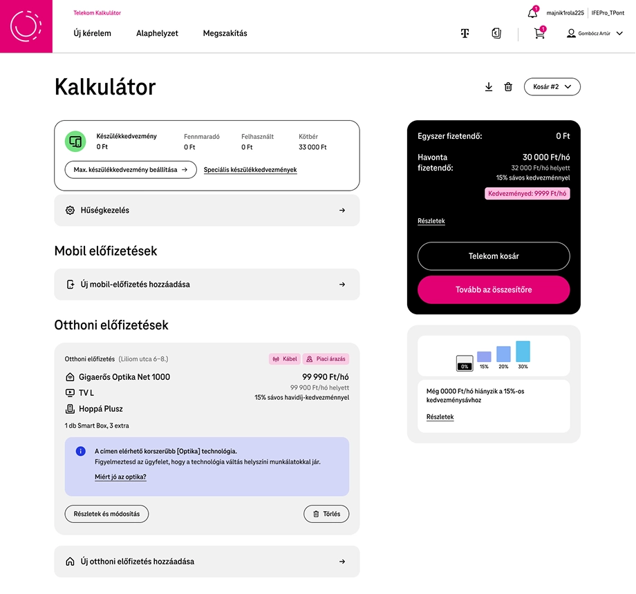
Redesign of internal system used by front office colleagues
Telekom's internal front-office experience wasn't fully aligned with the customer's digital journey — colleagues had to navigate disconnected processes to continue a journey started digitally.
Redesign the internal experience around the digital customer journey, making navigation simpler and connecting digital processes with assisted front-office interactions.
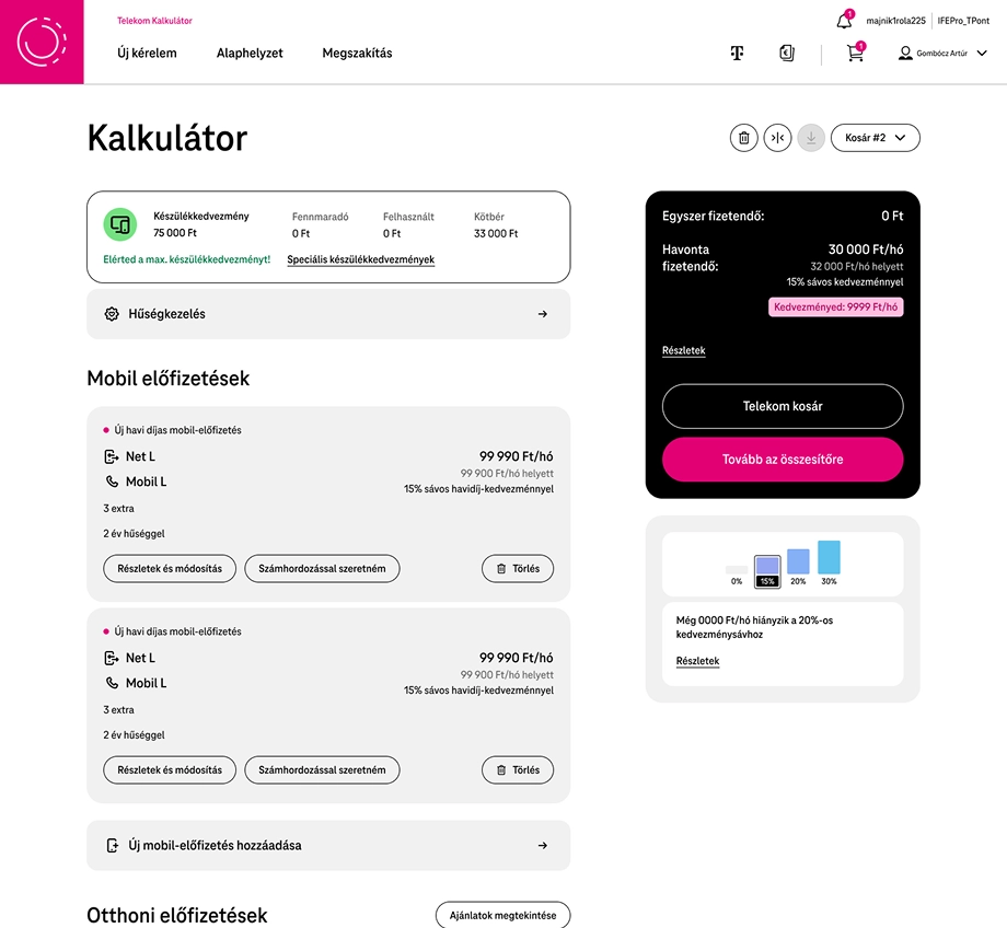
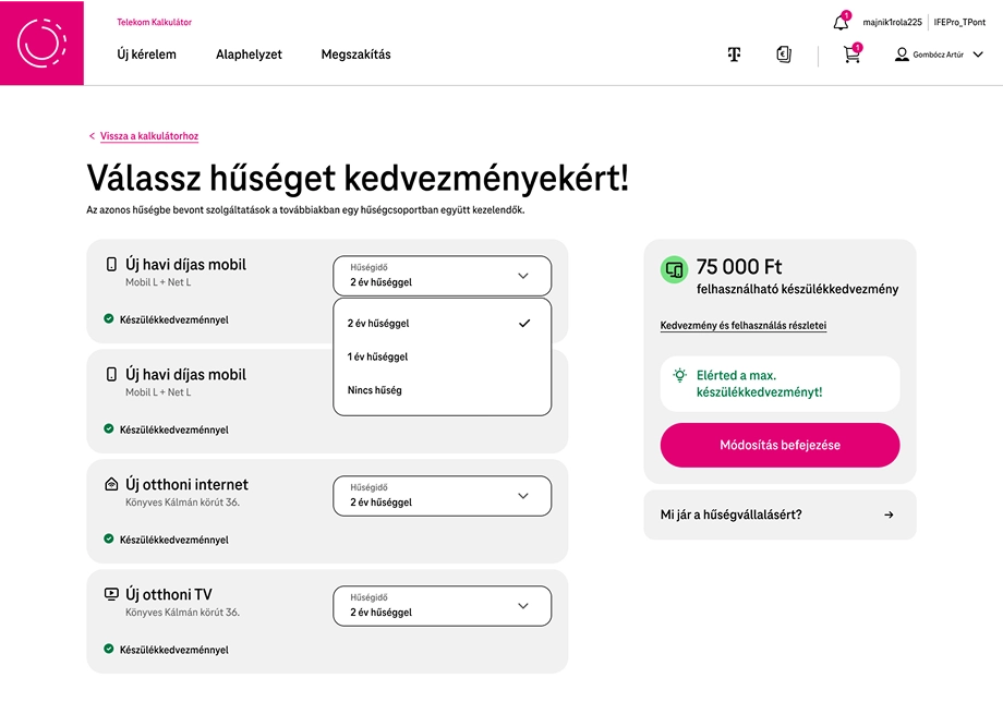
Restructured the configuration experience around customer needs instead of internal processes — making relevant actions easier to find, and letting colleagues continue, support, or redirect customers toward digital solutions.
Outcome — A more consistent connection between digital and assisted channels, with simpler colleague workflows that support Telekom's goal of maximizing digital share.
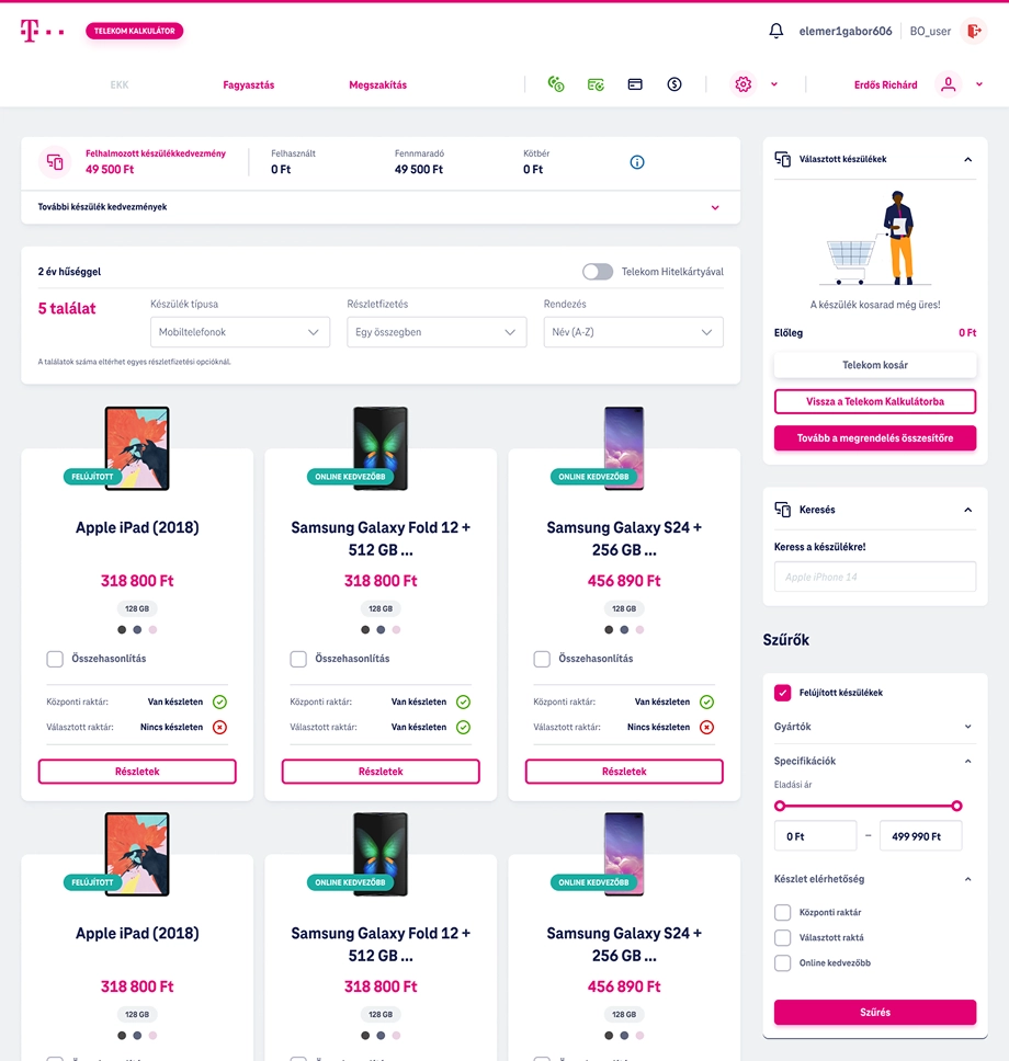
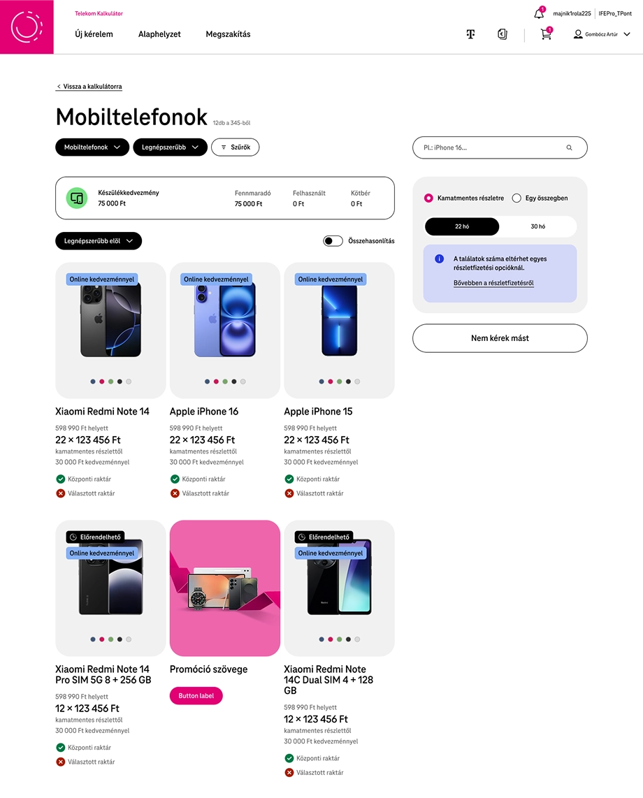
Redesigned device page with more transparent look and straightforward filtering with the support of flexible payment terms. Introducing cart feature available across the whole ordering process.
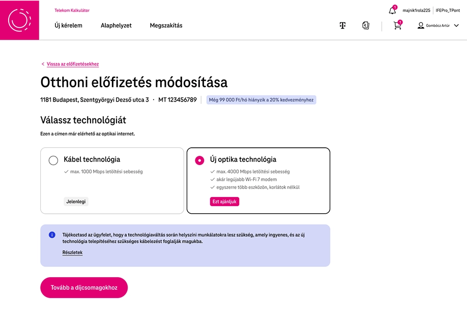
Redesigned the technology change process so it makes the user experience better, more transparent for the colleague with straightforward actions, and better sales potential with including the change to the configuration process — carrying straight through into a unified cart.
Trehab
Sport analytics platform
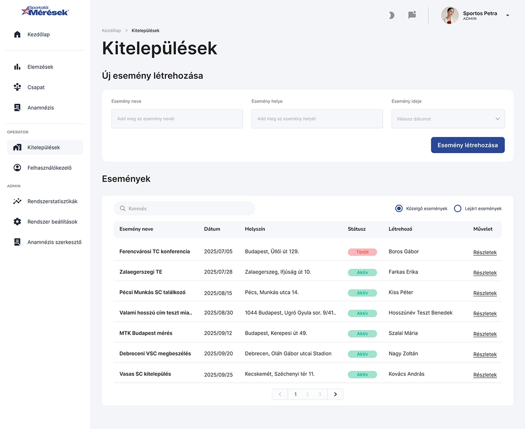
Sportolói Mérések provides physical performance testing for sports clubs and athletes — a marketing website that communicates its value, and a dashboard for exploring measurement results.
The website needed to communicate the value of the service and build trust, while the dashboard needed to turn complex measurement data into clear insights for athletes and coaches.
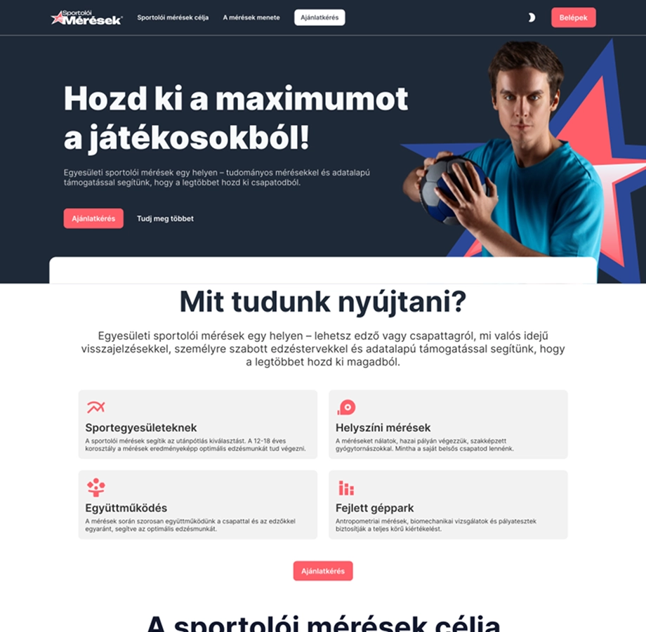
Website — Focused on creating a clear visual hierarchy around a mainly technical service, making it easy to understand what the measurements offer and guiding visitors toward a quote.
Athletes get a quick overview of their performance, recent measurements, trends, and upcoming events — then move into the analysis view for individual measurements.
Built around progressive detail: key indicators and trends first, individual measurements next. Visual status indicators make progress easy to read at a glance.
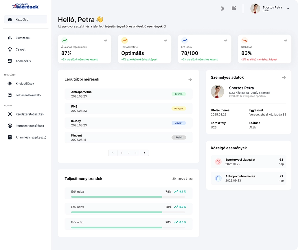
Behind the scenes, operators manage events and user access from a simplified admin area, kept consistent with the same visual language as the athlete-facing dashboard.
Nyerges Design
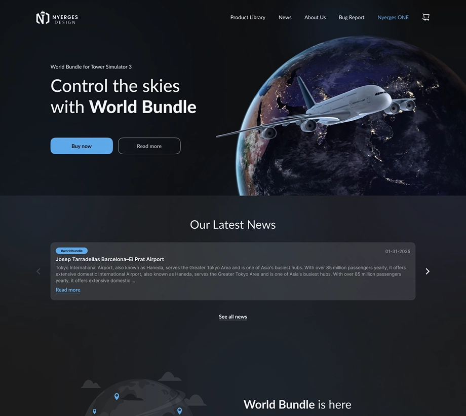
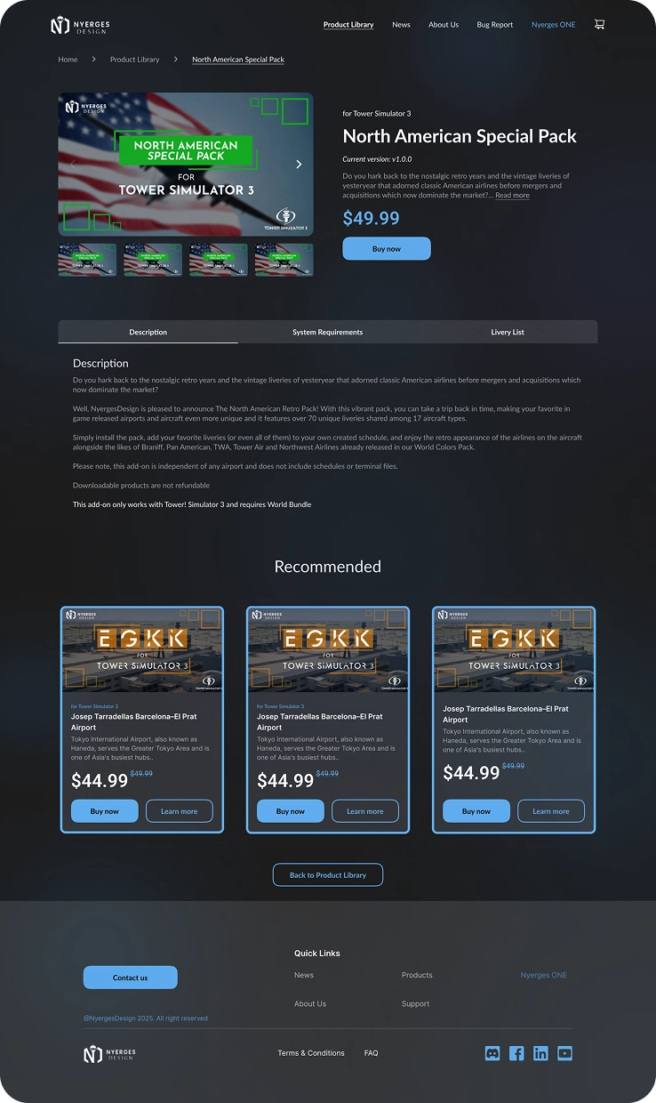
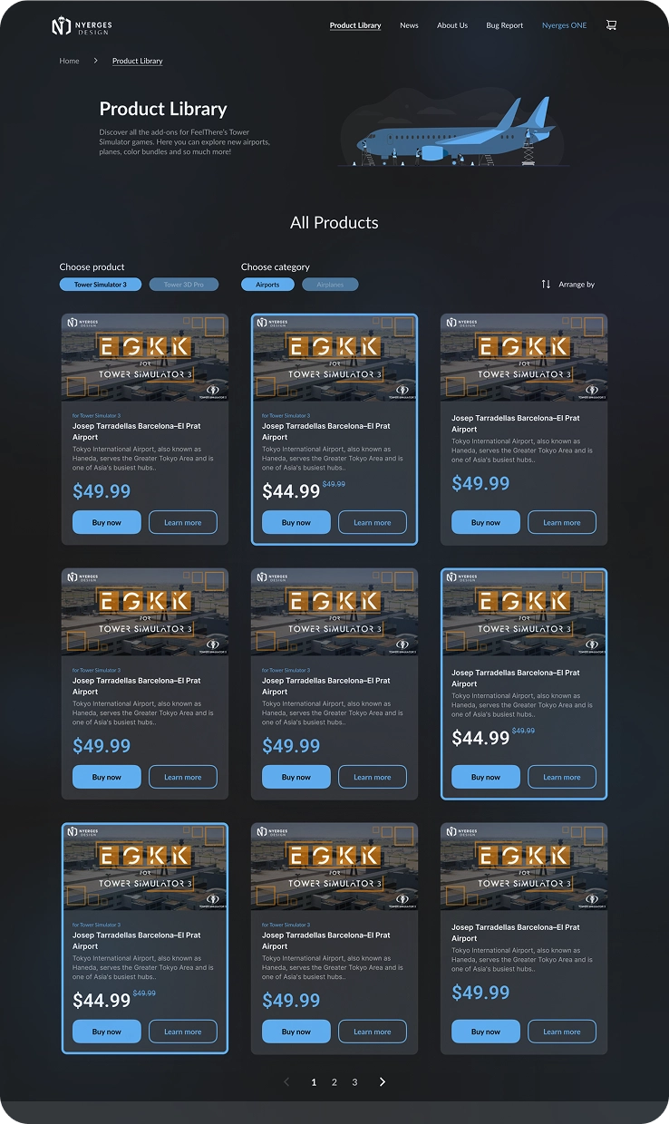
Storefront & Product Experience
Clearer product discovery and hierarchy — filtering by simulator and category, dedicated product pages, and a consistent visual language throughout.
Create a more cohesive storefront for Tower Simulator add-ons, making it easier for users to discover the right products and move confidently toward purchase.
Other projects
UX/UI DesignFord – Design Exam
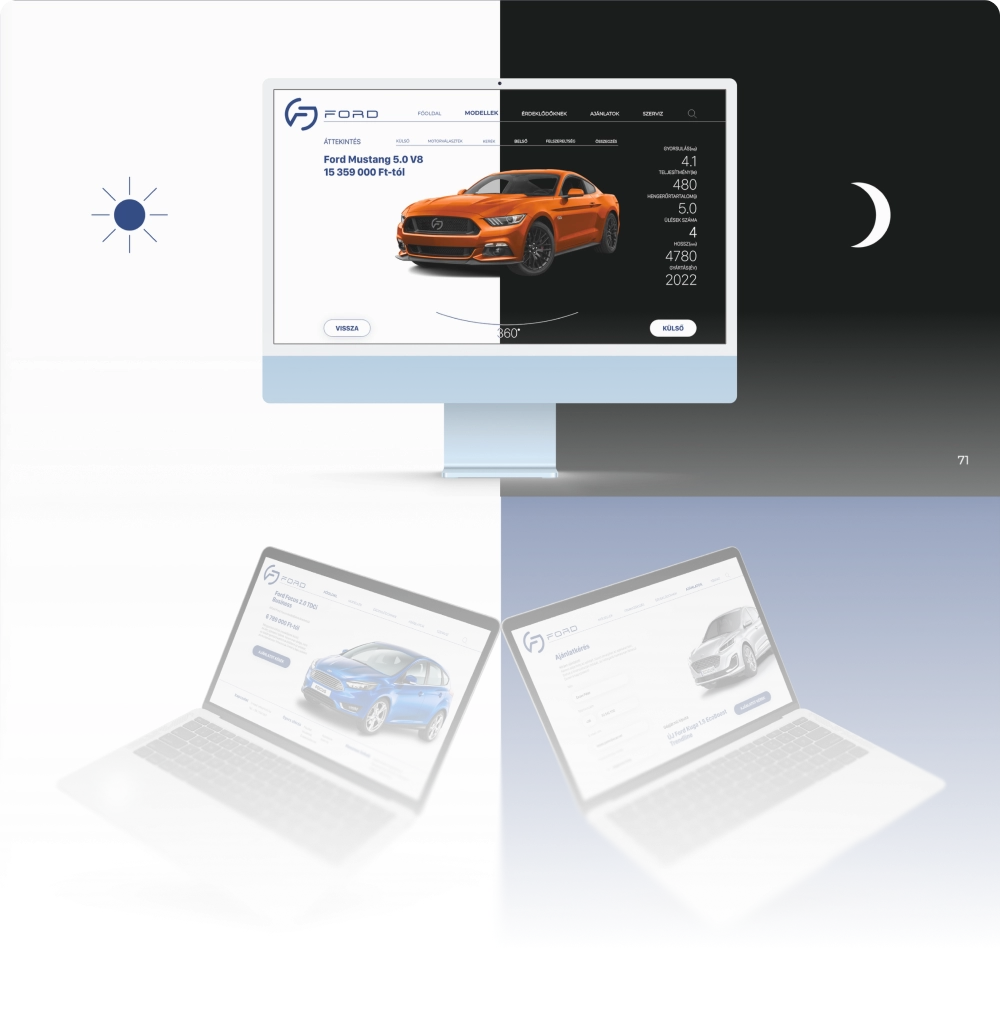
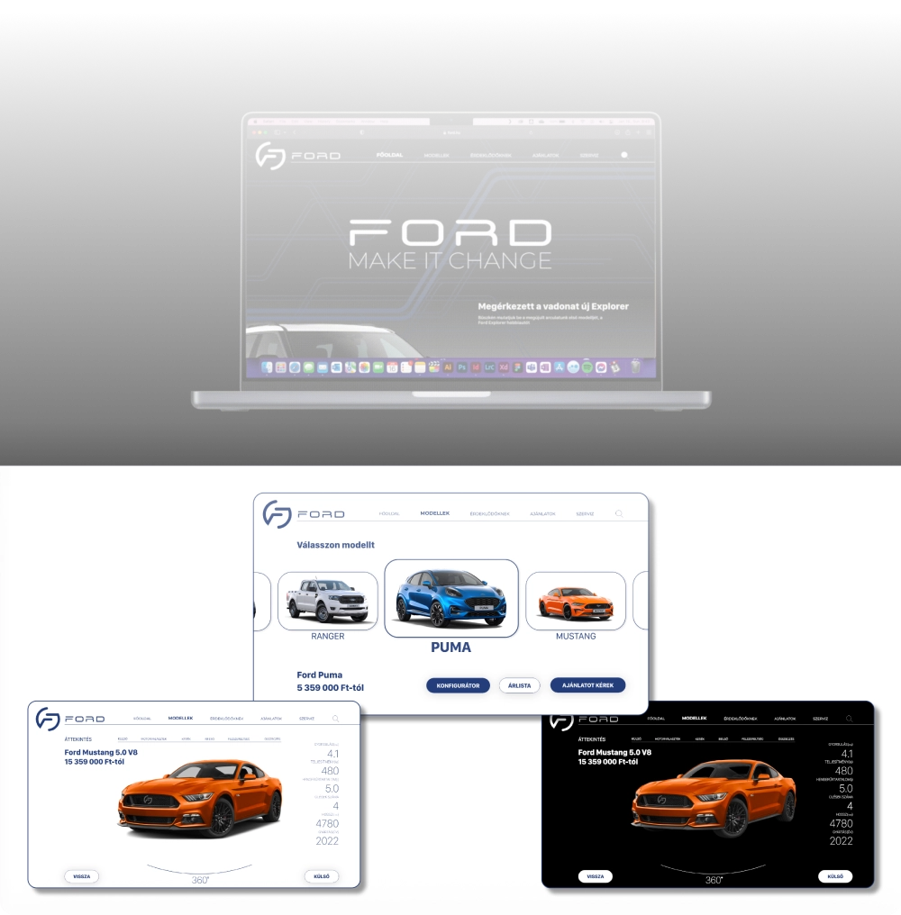
Reimagined Ford's identity to digital.
For my design qualification project, I explored how a reimagined Ford identity could work digitally — a concept site applying the new visual language across landing and vehicle pages.
Kirchhof Solutions
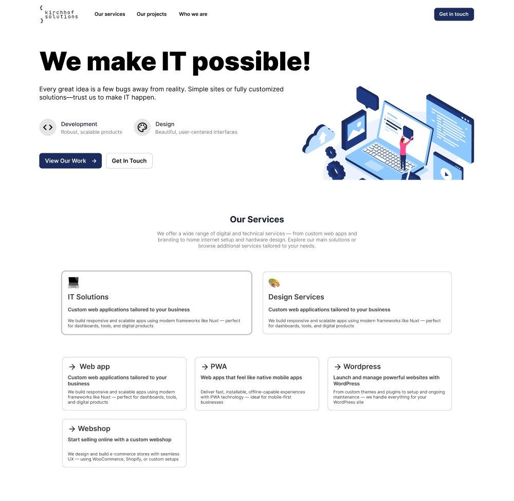
Visual identity for a small digital studio
I designed the visual identity, landing page, and business cards for Kirchhof Solutions, creating a simple and consistent brand for them.